
Role
UX Designer
Timeline
Q2 2024
team
2 UX Designers (including me)
Content Strategists
SEO Director
Developers
Skills
UX Research
UI Design
Design Strategy
Design Systems
Overview
Our client, a Fortune 500 pet insurance provider, had a high-traffic homepage that wasn't converting. Content-heavy layouts and poor scannability made it difficult for users to find what they needed, leading them to leave before taking action. I led research, design, and testing to redesign the homepage around how users actually consume information.
impact
increase in quote starts
increase in total CTA clicks
increase in page visits
Final solutions
Problem
Our client, a Fortune 500 pet insurance company, had high homepage traffic but struggled to engage users and convert them into customers. The page was content-heavy and difficult to scan, making it hard for users to find the information they were looking for and take action.

Competitive Analysis
I analyzed 10 pet insurance competitors' homepages to identify best practices across content strategy, design, and layout.
Page Layout
Clear visual hierarchy with content chunking to support scannability and reduce cognitive load.
CTA Design
Bold, contrasting primary CTAs with consistent language to guide users toward key actions.
Hero Design
Strong value propositions supported by concise bullet points highlighting key product benefits.
Informational Content
Secondary CTAs and links within informational sections improve discoverability and encourage site exploration.
Quantitative Analysis
I analyzed heatmaps and performance data to understand how users interacted with the page and identify potential areas for improvement.
Interactivity was concentrated at the top of the page. The hero CTA and the dog/cat product cards received the most clicks on the entire page.
Only 44% of users scrolled beyond the “Our Products” section, meaning the majority of the page’s content was never seen.
“Pet Health Insurance” and “Why Pet Insurance” sections had drop-off rates above 20%, likely due to large blocks of text and layouts that made scanning difficult.
Design
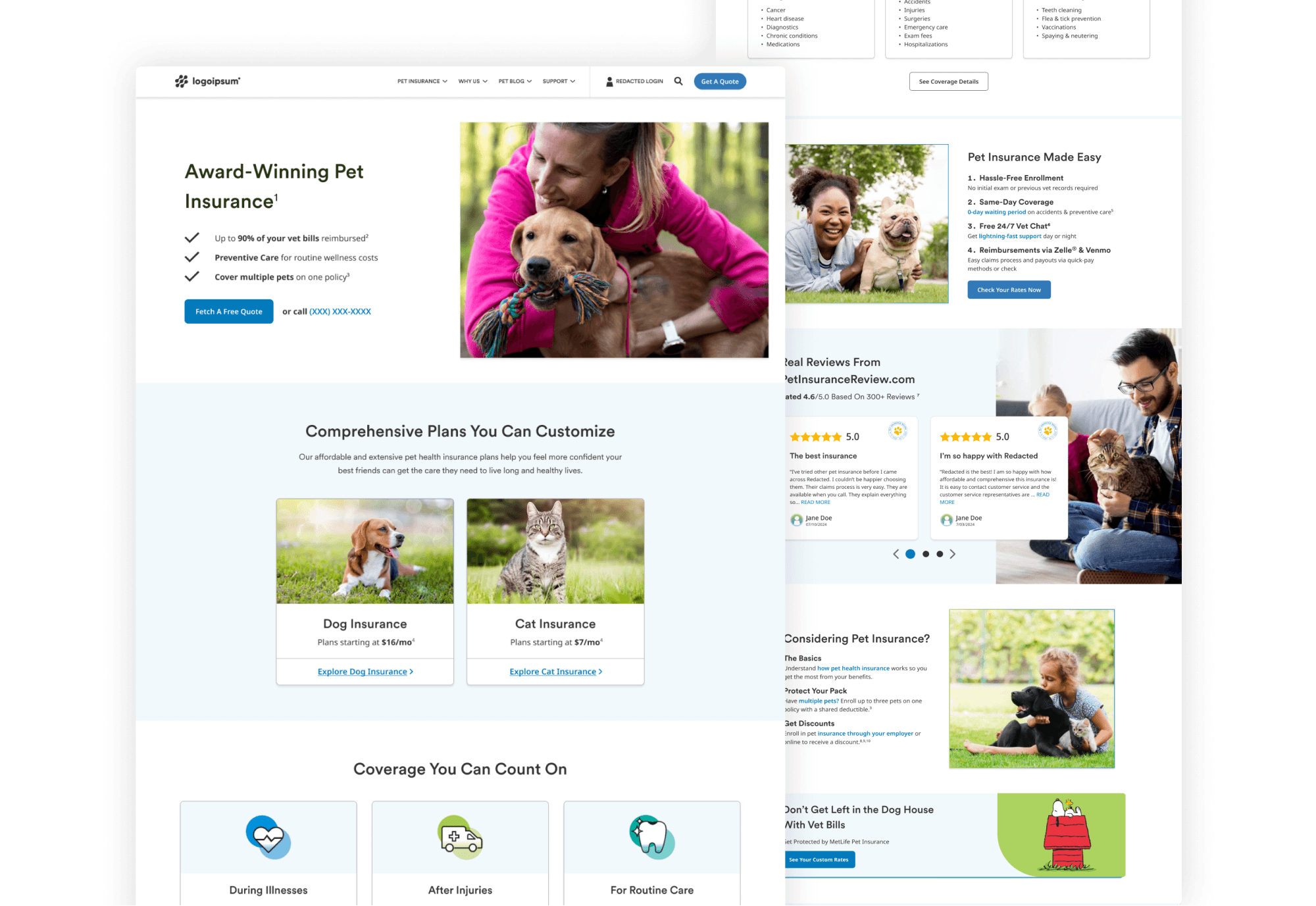
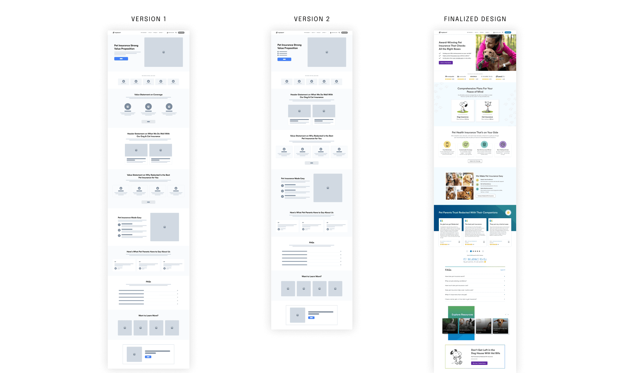
Research insights were transformed into a new homepage experience that enables users to locate the information they need efficiently. Collaborating with our content strategists, we optimized the content to ensure it aligned with users’ needs.
User testing
To validate the new design, I ran a 10-second impression test and comparative highlighter test with 7 participants, testing both the original and redesigned homepage side by side. The study confirmed improvements in scannability and trust while surfacing targeted areas for refinement.

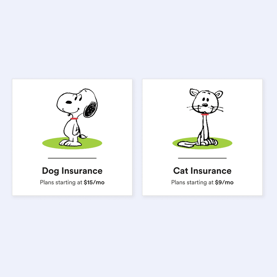
Some users didn't perceive the product cards as clickable due to the absence of visual cues to differentiate them from non-interactive elements.
Action: Add content indicators (e.g. "Explore cat insurance") and visual cues to signal interactivity.
Users found the reviews section lengthy and difficult to read, causing them to miss third-party validation elements and question whether the reviews were authentic.
Action: Simplify the design, increase visibility of third-party logos, and break text blocks into shorter, digestible chunks.


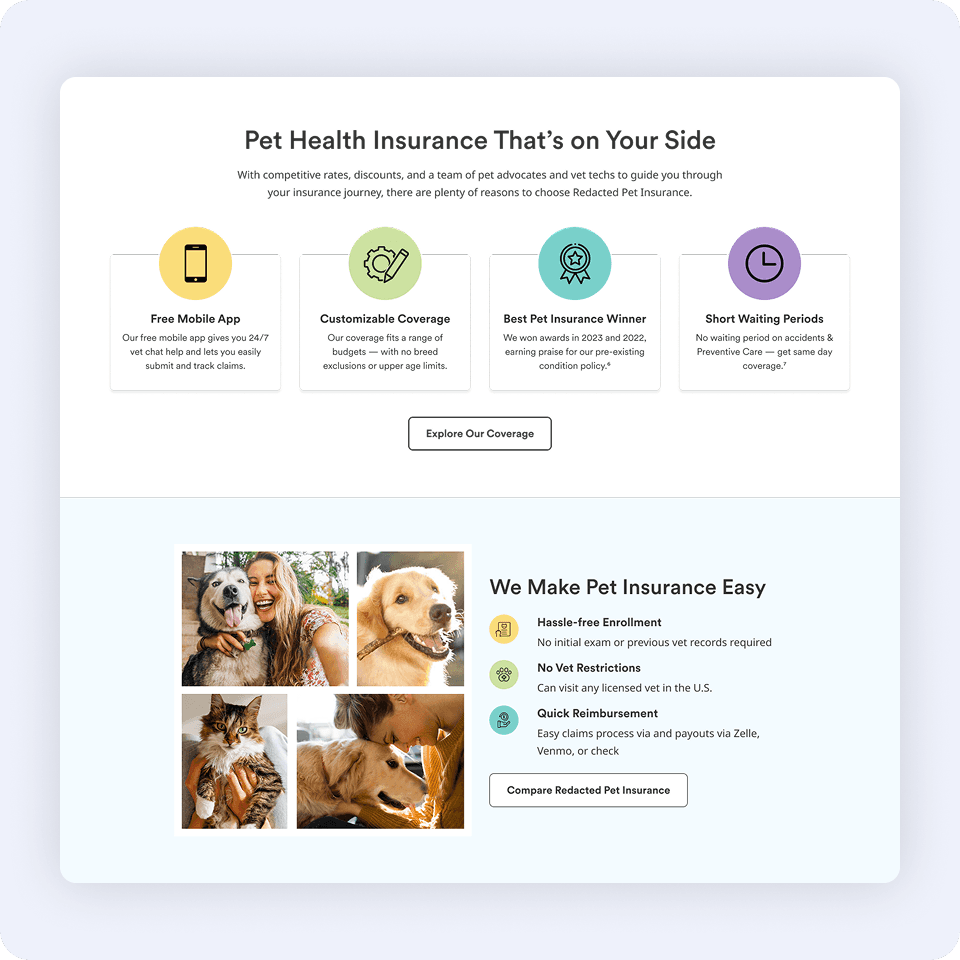
Users wanted more information about plans, coverage specifics, add-ons, and preventative care, but couldn't find it on the page.
Action: Add a dedicated coverages section and update page content to address user feedback.
Final solution
The final design addressed the core problem, a content-heavy page that overwhelmed users before they could act, by establishing a clear visual hierarchy, chunking content into scannable sections, and ensuring every interactive element communicated its purpose.
BEFORE

After

impact
The new homepage experience improved user engagement and quote starts within the first 30 days of launch.
+22%
increase in quote starts
+12%
increase in total CTA clicks
+12%
increase in page visits
View more work
fortune 500 pet insurance company
JTBD research study uncovering pet owner motivations to align content strategy and website experience with what actually drives decisions.
auditboard
Designed an optimized landing page for internal audit management software, resulting in a 100% increase in conversion rate.